.jpg)
|
➵ TIP
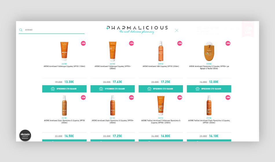
The presentation of the products must be done partially to the user. Otherwise it causes confusion. More specifically, the product page should display the items that the user wants based on the label. |
|
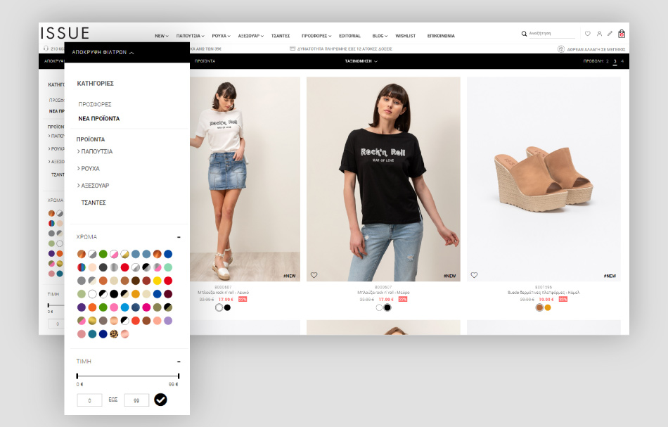
➵ SEO TIP
The use of this practice facilitates the creation of the well-known "how-to" or "buyer guide", which will improve the organization of categories with various long-tail keywords. |
|
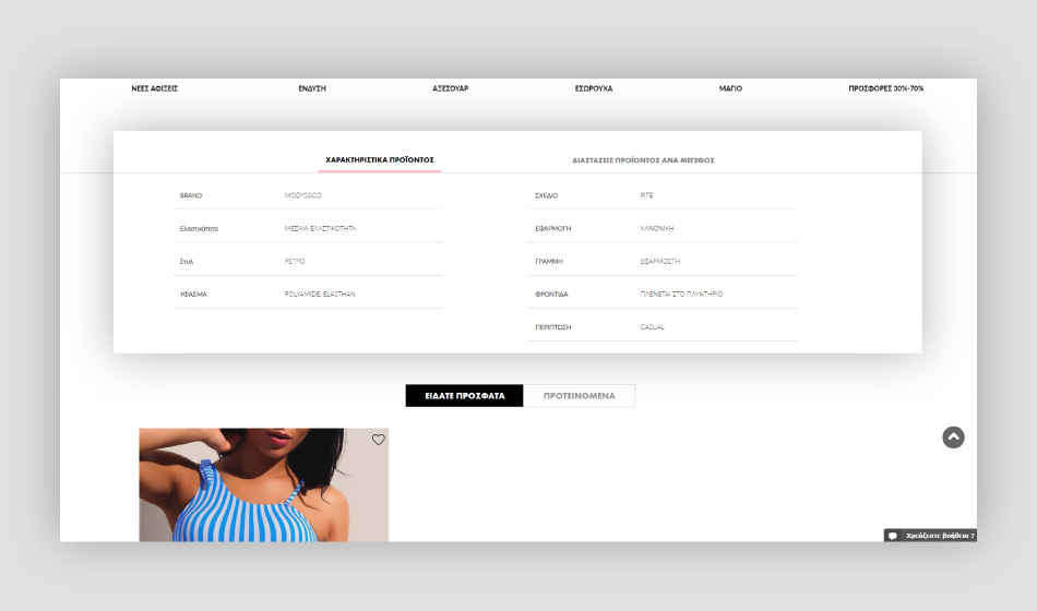
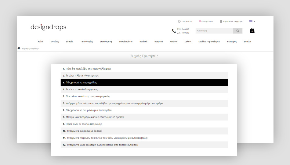
➵ TIP
If the product has a lot of necessary information then tabs can be used according to the characteristics of the products. |
.jpg)
|
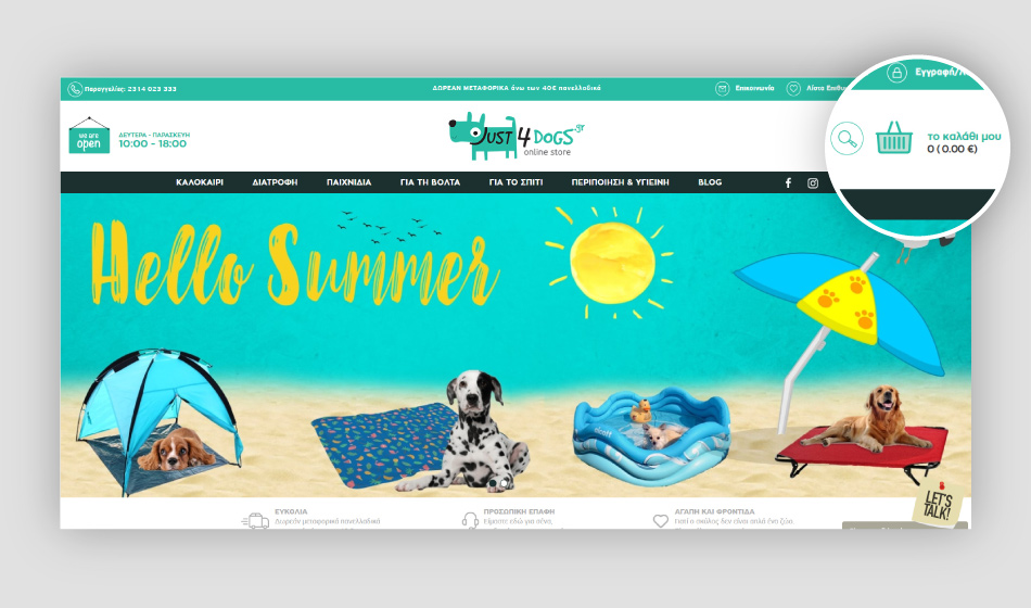
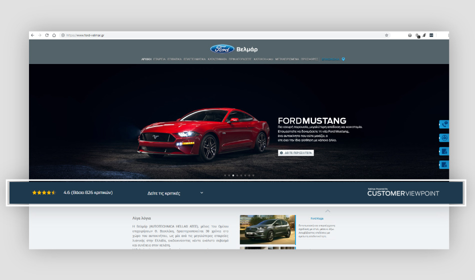
➵ TIP
A well structured homepage wins impressions and increases user's interaction with the website. So, avoid using it as a product list and design an attractive structure. |

|
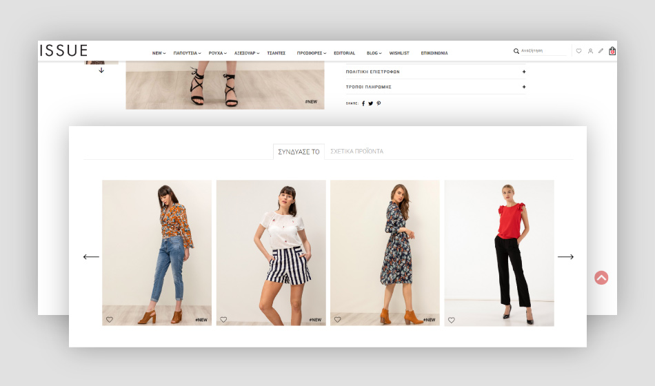
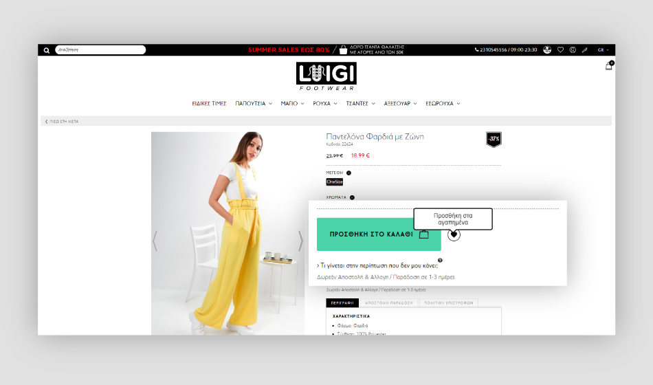
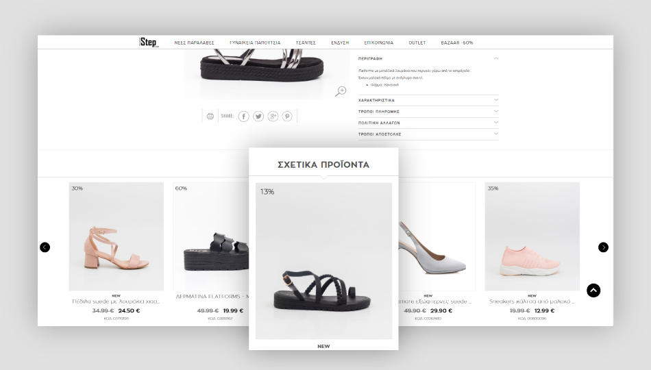
➵ PRO TIP
Product photos can be a group of photos from different perspectives. So the eCommerce user can have a closer look at the product. |
|
➵ PRO TIP
An important tool for this step is the Schema mark-up for customer reviews or testimonials. |

|
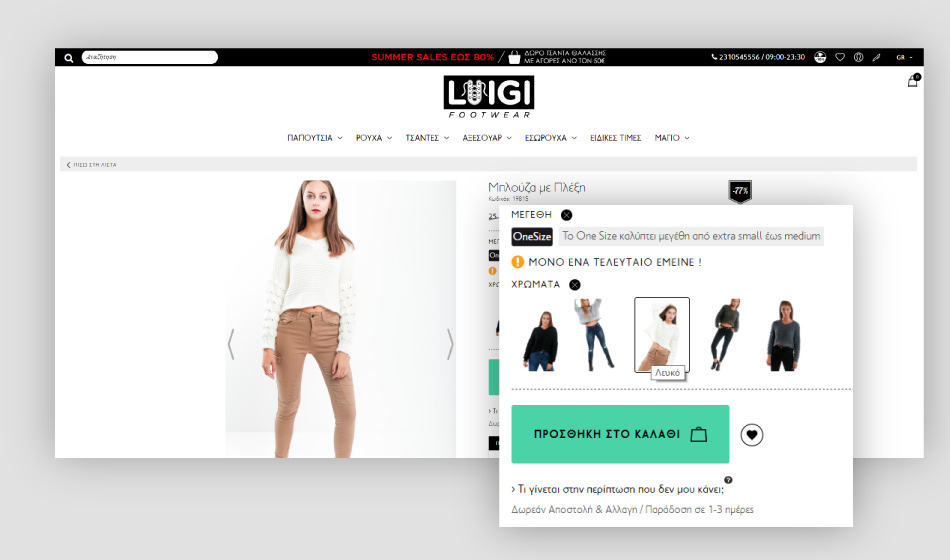
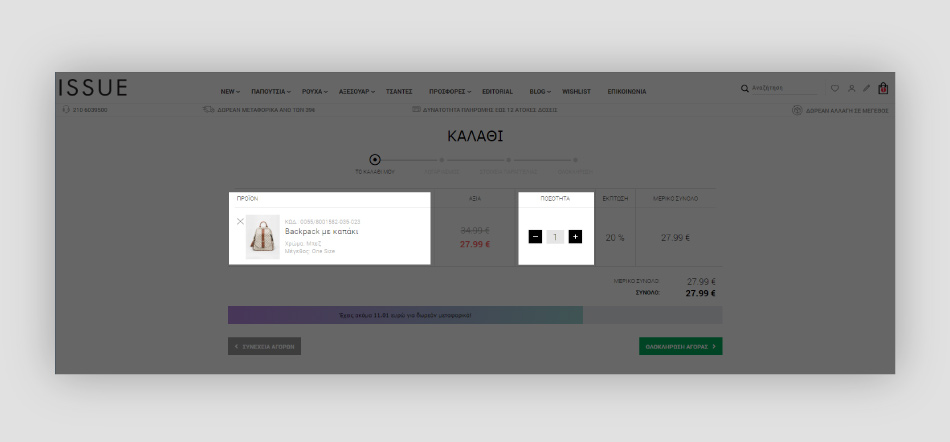
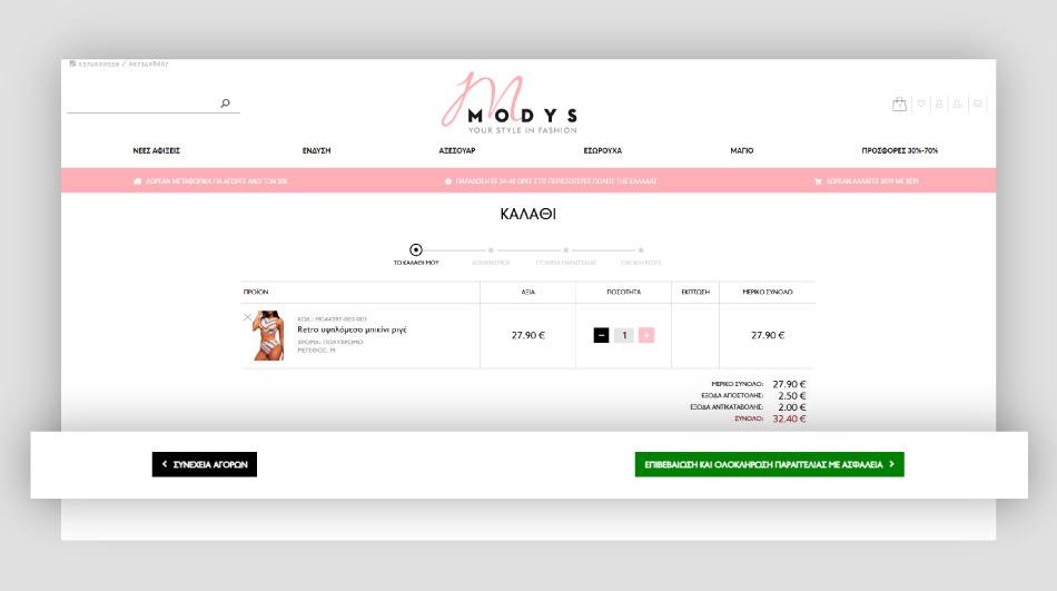
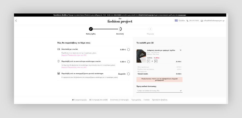
➵ TIP
With the checklist button the user can examine the products to be purchased and refine his order. |


|
➵ TIP
The redirection to the social media page must be done by opening a new tab, to avoid the user leaving the website. |

Τα αναγκαία, άλλως, απολύτως απαραίτητα cookies, είναι ουσιαστικής σημασίας για την ορθή λειτουργία της ιστοσελίδας μας, σας επιτρέπουν να κάνετε περιήγηση και να χρησιμοποιήσετε τις λειτουργίες τους, όπως πρόσβαση σε ασφαλείς περιοχές ή χρήση του καλαθιού αγοράς. Αυτά τα cookies δεν αναγνωρίζουν την ατομική σας ταυτότητα. Χωρίς αυτά τα cookies, δεν μπορούμε να προσφέρουμε αποτελεσματική λειτουργία των Δικτυακών μας Τόπων.
Αυτά τα cookies συλλέγουν πληροφορίες σχετικά με τον τρόπο που οι επισκέπτες χρησιμοποιούν τους Δικτυακούς μας Τόπους, για παράδειγμα, ποιες σελίδες επισκέπτονται συχνότερα και αν λαμβάνουν μηνύματα σφαλμάτων από ιστοσελίδες. Αυτά τα cookies συλλέγουν συγκεντρωτικές, ανώνυμες πληροφορίες που δεν ταυτοποιούν κάποιον επισκέπτη. Χρησιμοποιούνται αποκλειστικά για τη βελτίωση των επιδόσεων μίας ιστοσελίδας.
Αυτά τα cookies χρησιμοποιούνται για την παροχή περιεχομένου, που ταιριάζει περισσότερο σε εσάς και τα ενδιαφέροντά σας. Μπορεί να χρησιμοποιηθούν για την αποστολή στοχευμένης διαφήμισης/προσφορών, τον περιορισμό προβολών διαφήμισης ή την μέτρηση αποτελεσματικότητας μιας διαφημιστικής καμπάνιας. Μπορεί να χρησιμοποιηθούν αυτά τα cookies για να θυμόμαστε τους ιστότοπους που έχετε επισκεφθεί ώστε να καθορίσουμε ποια ηλεκτρονικά κανάλια μάρκετινγκ είναι πιο αποτελεσματικά και μας επιτρέπουν να επιβραβεύσουμε εξωτερικές ιστοσελίδες και συνεργάτες που σας προώθησαν σε εμάς.
Τα «cookies» είναι μικρά κομμάτια αρχείων σε μορφή κειμένου, τα οποία αποθηκεύονται στον περιηγητή (browser) του χρήστη όταν επισκέπτεται έναν ιστότοπο. Οι πληροφορίες οι οποίες αποθηκεύονται στον υπολογιστή του χρήστη μπορεί να περιέχουν στοιχεία όπως ποιες είναι οι σελίδες που επισκέφτηκε ο χρήστης, την ημερομηνία και την ώρα της επίσκεψης καθώς και κάποιον τυχαίο και μοναδικό αριθμό αναγνώρισης του χρήστη. Σε καμία περίπτωση τα cookies δεν περιέχουν προσωπικές πληροφορίες ή πληροφορίες, οι οποίες θα επιτρέψουν σε οποιονδήποτε να επικοινωνήσει με τον επισκέπτη του δικτυακού τόπου, μέσω τηλεφώνου, e-mail, κ.λπ. Επιπλέον, με την χρήση των cookies δεν υπάρχει πρόσβαση στα έγγραφα ή αρχεία του υπολογιστή σας.
Με την χρήση αυτή, το site είναι σε θέση να αποθηκεύσει χρήσιμες πληροφορίες για την περιήγηση του χρήστη στο site, καθώς και να διαβάσει τις πληροφορίες αυτές ώστε να προσφέρει στον χρήστη μια ενοποιημένη εμπειρία περιήγησης.
Επιπλέον, τα cookies μας βοηθούν να βλέπουμε την απόδοση και την επισκεψιμότητα της ιστοσελίδας μας, βελτιώνοντας την παρουσίαση και το περιεχόμενό της, σύμφωνα με τις προτιμήσεις των επισκεπτών μας.